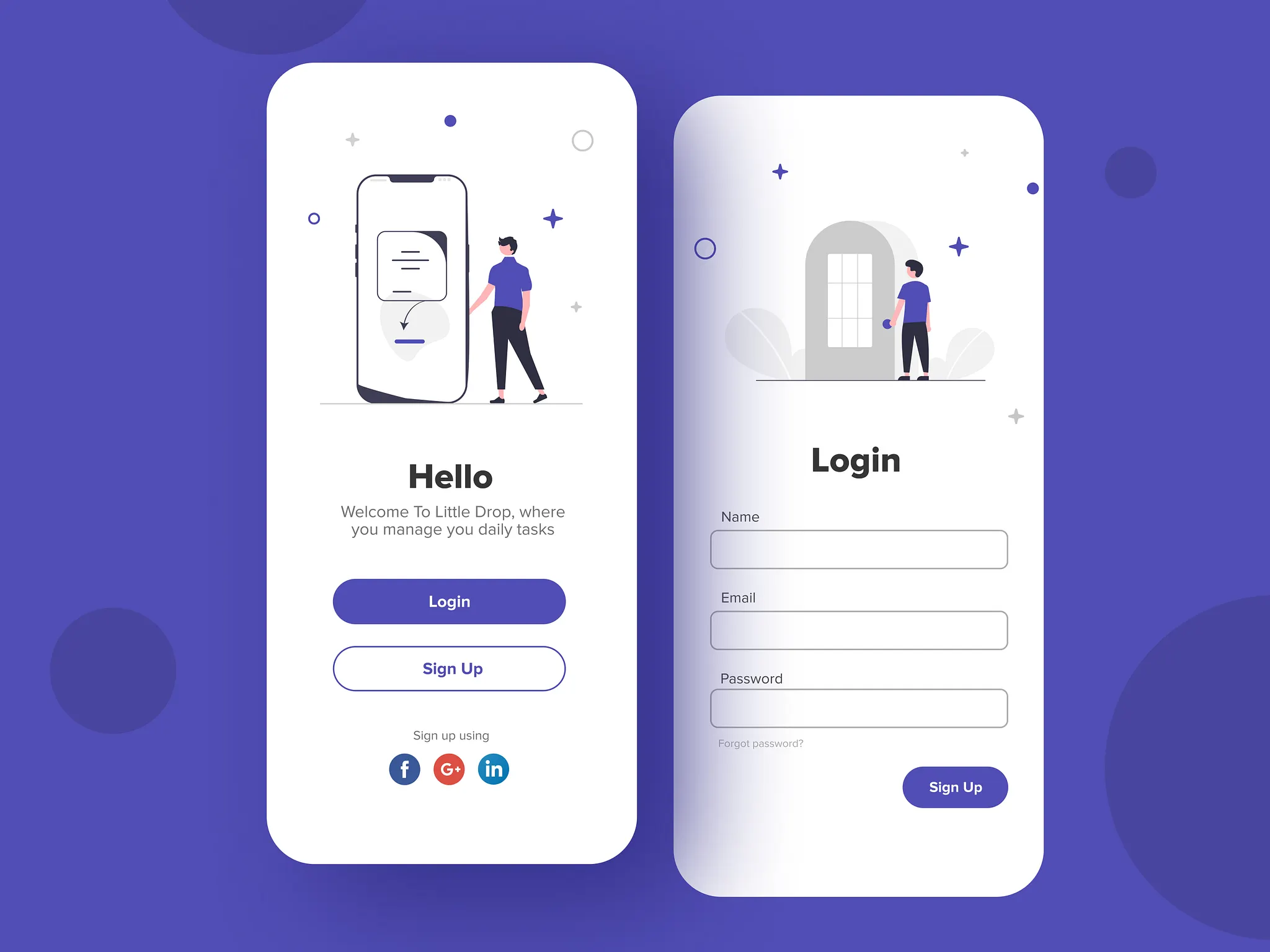
Day 21: Buttons & Inputs
Master Flutter Buttons & Inputs! Learn ElevatedButton, OutlinedButton, TextButton, the new spacing parameter, and build a modern login screen with floating labels. From static layouts to interactive UIs!

ရှေ့ရက်တွေက အခြေခံ widget တွေ တော်တော်များများ ဆွေးနွေးပြီးပြီဆိုတော့ ဒီနေ့တော့ interaction ပိုင်းတွေနဲ့ ပတ်သက်ပြီး စပြီးတော့ ကြည့်လိုက်ကြရအောင်ပါ။ UI တွေ လှနေအောင် ဆောက်ပြီး interact လုပ်မရဘူးဆိုရင် သိပ်ပြီး အသုံးမဝင်လှပါဘူး။ ဒီတော့ interaction တွေနဲ့ပတ်သက်ပြီး နားလည်ထားဖို့နဲ့ UI တွေ တည်ဆောက်တဲ့အခါ သုံးတတ်ဖို့ အရေးကြီးပါတယ်။
Buttons
အရင် ၂၀၂၀၊ ၂၀၂၁ က Flutter ကိုလေ့လာခဲ့ဖူးတယ်ဆို အဲ့တုန်းက ရှိခဲ့တဲ့ FlatButton, RaisedButton, OutlineButton တို့ကို သုံးခဲ့ဖူးကြပါလိမ့်မယ်။ အခုတော့ အရင်တုန်းက ရေးခဲ့တာတွေကို မေ့လိုက်လို့ရပါပြီ။ အဲ့တုန်းက ရေးနည်းတွေက မလိုအပ်ပဲ ရှုပ်နေလို့ အခု ပိုပြီးတော့ သိလွယ်မှတ်လွယ်တာတွေ အဖြစ်ပြောင်းသွားလို့ပါ။
အခု Button ရေးနည်းအသစ်တွေကိုတော့ visual hierarchy ပေါ် အခြေခံပြီး ပြုလုပ်ထားတာ ဖြစ်ပါတယ်။
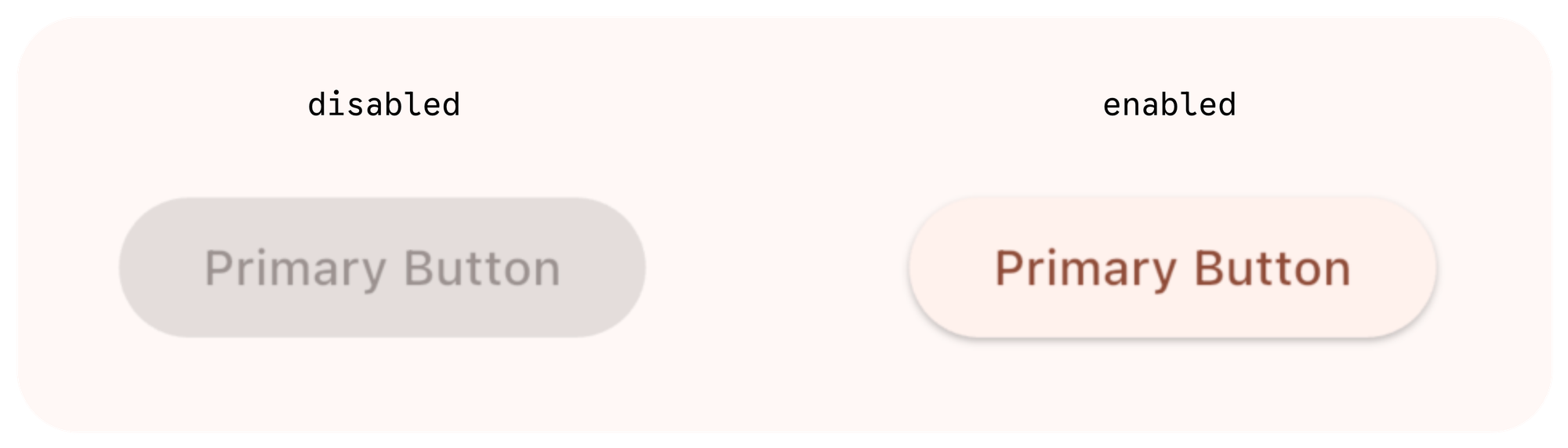
ElevatedButton - Primary Action Button
ဒါကတော့ user တွေကို ပြုလုပ်စေချင်တဲ့ action တွေ guide လုပ်ပေးဖို့အတွက် အဓိက သုံးပါတယ်။ Form ရဲ့ "Submit" button တို့, product page လိုမျိုးမှာဆို "Buy now" button တို့, registration screen က "Sign Up" button တို့မှာ သုံးကြပါတယ်။ User ရဲ့ attention အဓိက ရောက်စေချင်တဲ့ နေရာတွေမှာ သုံးသင့်ပါတယ်။ UI တခုမှာ primary action တခုလောက်ပဲ ရှိသင့်ပါတယ်။ တခုထက်များနေရင်တော့ user ကို စိတ်ရှုပ်သွားစေတတ်ပါတယ်။

OutlinedButton - Secondary Action Button
ဒါကတော့ primary action button ကို ခြံရံဖို့ သုံးနိုင်ပါတယ်။ Primary လောက် အရေးမပါပေမယ့် action အနေနဲ့ လုပ်ဆောင်ချက် ထည့်ထားချင်တဲ့အခါ သူ့ကို အသုံးပြုနိုင်ပါတယ်။ "Submit" button ဘေးမှာရှိတဲ့ "Cancel" button တို့, "Buy Now" ဘေးမှာ ရှိတဲ့ "Read More" button တို့ကို secondary action button တွေ အနေနဲ့ မြင်ကြည့်လို့ ရပါတယ်။

TextButton - Low-priority Action Button
ဒါကတော့ user ကို action လုပ်လို့ရအောင် ပေးထားချင်ပေမယ့် အမြင်မှာ အနှောင့်အယှက်ဖြစ်တာမျိုး မလိုလားတဲ့အခါ သုံးနိုင်ပါတယ်။ "Forgot password?" တို့, "Skip" တို့, "Terms & Conditions" တို့ကို text button အနေနဲ့ အသုံးများတာ တွေ့ဖူးကြမယ် ထင်ပါတယ်။

ဒါကတော့ Flutter မှာပေးထားတဲ့ အဓိက button တွေနဲ့ သူတို့ရဲ့ အသုံးပြုသင့်တဲ့နေရာတွေအကြောင်း ပြောသွားတာပဲ ဖြစ်ပါတယ်။ ဒါတွေကို မျှတအောင် သုံးပေးခြင်းအားဖြင့် user experience ကို ပိုကောင်းစေပါလိမ့်မယ်။
ဆက်ပြီးတော့ button ထဲမှာပါတဲ့ properties တွေကို ဘယ်လိုမျိုး အသုံးပြုလို့ရမလဲဆိုတာ ဆက်ကြည့်ကြရအောင်ပါ။ ဘယ် button ကိုပဲ သုံးသည်ဖြစ်စေ သူ့ထဲမှာ ထည့်ကို ထည့်ပေးရမယ့် onPressed နဲ့ child properties ၂ခု ရှိပါတယ်။
onPressed
ဒါကတော့ button ကို နှိပ်လိုက်တဲ့အခါ ဘာတွေလုပ်ဆောင်မလဲဆိုတဲ့ function/method တွေ ရေးဖို့အတွက်ပဲ ဖြစ်ပါတယ်။ action button ဖြစ်တဲ့အတွက် ဘာ action လုပ်ဆောင်ချင်တာလဲဆိုတာ explicit ထင်ထင်ရှားရှား ကြေငြာပေးဖို့ လိုတာပဲ ဖြစ်ပါတယ်။ တကယ်လို့ အခြား value တွေကို အခြေခံလို့ပဲ ဖြစ်ဖြစ် အကြောင်းအမျိုးမျိုးကြောင့် နှိပ်မရအောင် လုပ်ချင်တယ်ဆို onPressed ကို null အနေနဲ့ သတ်မှတ်ပေးလို့ရပါတယ်။ null လို့သတ်မှတ်လိုက်တဲ့အခါ button က disabled ဖြစ်သွားမှာပါ။
child
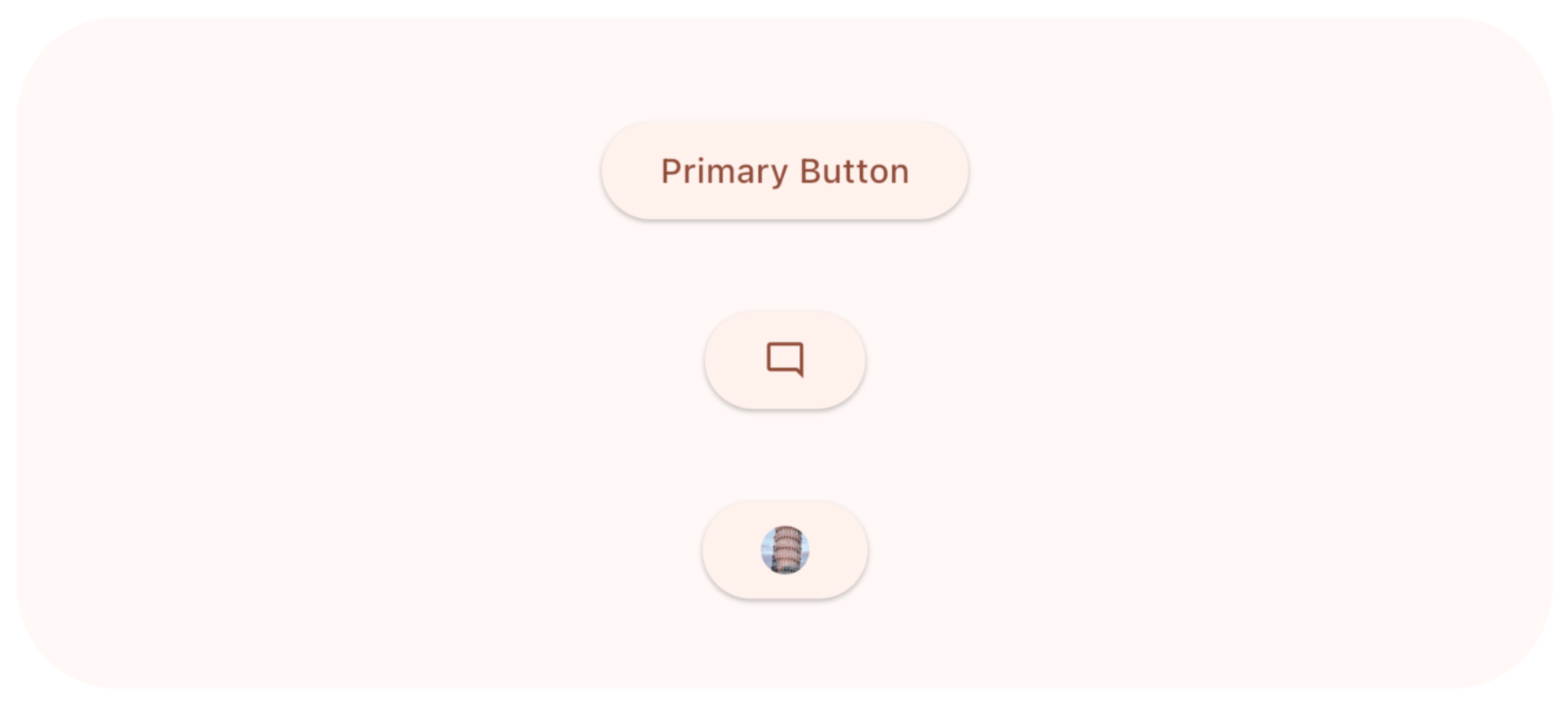
ဒါကတော့ button ထဲမှာ စာသား, icon စသဖြင့် မြင်ချင်တဲ့ widget ကို သတ်မှတ်ပေးလို့ရပါတယ်။ စာမြင်ချင်ရင် Text widget ကို သုံးပြီးတော့ icon တွေ မြင်ချင်ရင် Icon Widget ကို သုံးလို့ ရပါတယ်။
ElevatedButton(
  onPressed: () {},
  child: Text("Primary Button")
),
ElevatedButton(
  onPressed: () {},
  child: Icon(Icons.mode_comment_outlined),
),
ElevatedButton(
  onPressed: () {},
  child: CircleAvatar(
    radius: 10,
    foregroundImage: NetworkImage('https://picsum.photos/200'),
  ),
),
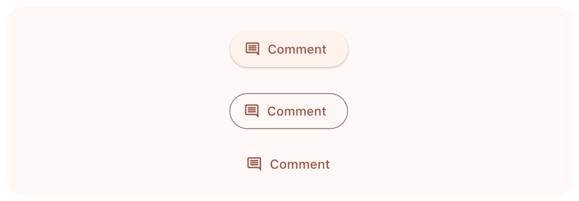
Icon + Text Button
တကယ်လို့ icon ရော စာပါ ပြချင်တယ်ဆိုရင်တော့ ..Button.icon ဆိုတဲ့ factory pattern ကို သုံးလို့ရပါတယ်။
ElevatedButton.icon(
  onPressed: () {},
  label: Text("Comment"),
  icon: Icon(Icons.comment_outlined),
),
OutlinedButton.icon(
  onPressed: () {},
  label: Text("Comment"),
  icon: Icon(Icons.comment_outlined),
),
TextButton.icon(
  onPressed: () {},
  label: Text("Comment"),
  icon: Icon(Icons.comment_outlined),
),
Styling
Button ကို သုံးတဲ့အချိန်မှာ design တွေကိုလဲ လိုအပ်သလို ပြင်ဆင်လို့ရပါတယ်။ ပြင်ဆင်ဖို့အတွက်ဆိုရင်တော့ style property ကို သုံးလို့ရပါတယ်။ ရှိပြီးသား design ကို အခြေခံပြီး ပြင်ဆင်တာ လုပ်ချင်တယ်ဆိုရင် .styleFrom ကို သုံးလို့ရပါတယ်။
ElevatedButton.icon(
  onPressed: () {
    print("Primary Action Clicked");
  },
  icon: const Icon(Icons.send),
  label: const Text("Send Message"),
  style: ElevatedButton.styleFrom(
    backgroundColor: Colors.blue,
    foregroundColor: Colors.white,
    padding: const EdgeInsets.symmetric(horizontal: 32, vertical: 16),
  ),
),
OutlinedButton(
  onPressed: () {
    print("Secondary Action Clicked");
  },
  style: OutlinedButton.styleFrom(
    foregroundColor: Colors.blue,
    side: const BorderSide(color: Colors.blue, width: 2),
    padding: const EdgeInsets.symmetric(horizontal: 32, vertical: 16),
  ),
  child: const Text("Save Draft"),
),
TextButton(
  onPressed: () {
    print("Destructive Action Clicked");
  },
  style: TextButton.styleFrom(
    foregroundColor: Colors.red,
    padding: const EdgeInsets.symmetric(horizontal: 32, vertical: 16),
  ),
  child: const Text("Delete Account"),
),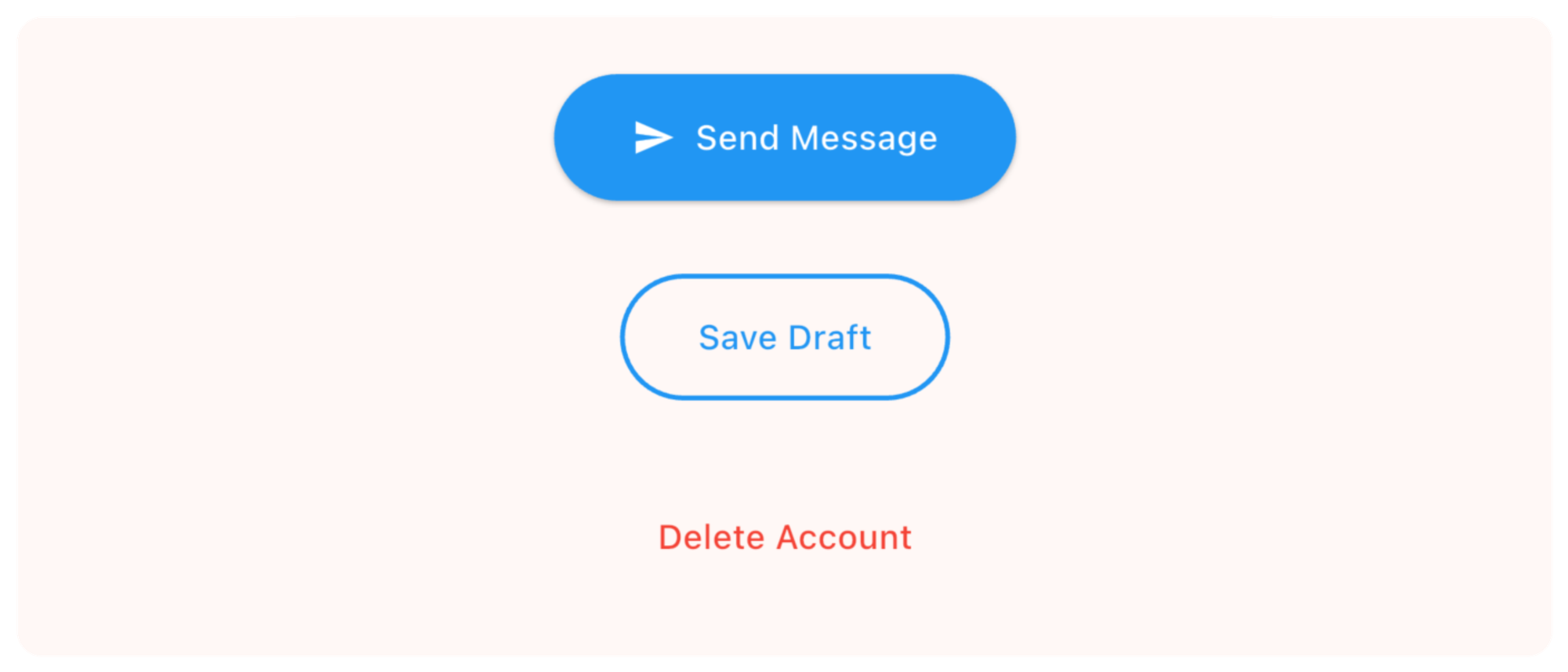
အပေါ်မှာ ပြထားတဲ့ styleFrom ထဲက properties တွေကို ကြည့်မယ်ဆို
backgroundColor- နောက်ခံအရောင်foregroundColor- စာသားအရောင်side- ပတ်လည် border တွေနဲ့ ပတ်သက်တဲ့ design တွေ သတ်မှတ်ချင်တဲ့အခါpadding- ပတ်လည် padding တွေ သတ်မှတ်ချင်တဲ့အခါ
ဒါတွေအပြင် တခြား properties တွေ အများကြီးလဲ ပါပါသေးတယ်။ စမ်းသပ်ကြည့်လို့ ရပါတယ်။
ဒါဆိုရင် state တွေနဲ့ ပေါင်းစပ်ပြီး Button ကိုဘယ်လို သုံးလို့ရမလဲကြည့်ရအောင်ပါ။
class DisabledButtonDemo extends StatefulWidget {
  const DisabledButtonDemo({super.key});

  @override
  State<DisabledButtonDemo> createState() => _DisabledButtonDemoState();
}

class _DisabledButtonDemoState extends State<DisabledButtonDemo> {
  bool _agreedToTerms = false;

  @override
  Widget build(BuildContext context) {
    return Column(
      mainAxisAlignment: MainAxisAlignment.center,
      spacing: 20,
      children: [
        CheckboxListTile(
          title: const Text("I agree to the Terms and Conditions"),
          value: _agreedToTerms,
          onChanged: (value) {
            setState(() {
              _agreedToTerms = value ?? false;
            });
          },
        ),
        ElevatedButton(
          onPressed: _agreedToTerms
              ? () => print("Account Created!")
              : null,
          child: const Text("Create Account"),
        ),
      ],
    );
  }
}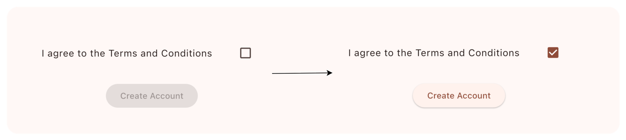
ဒီမှာ terms & condition ကို agree ဖြစ်မဖြစ် စစ်ပြီး agree ဖြစ်တော့မှ button ကို enable ပေးတာမျိုး ဖြစ်ပါတယ်။
Inputs
Flutter မှာ user input တွေ လက်ခံချင်တယ်ဆို အသုံးပြုလို့ရတဲ့ Widget ၂မျိုး ရှိပါတယ်။ တခုကတော့ TextField ဖြစ်ပြီး နောက်တခုကတော့ TextFormField ဖြစ်ပါတယ်။ သူတို့၂ခုက ဘာတွေ ကွာသလဲ ဆက်ပြီး ကြည့်လိုက်ရအောင်ပါ။
TextField
TextField ကိုတော့ text input ချည်းသပ်သပ် လက်ခံချင်တဲ့အခါ အသုံးပြုပါတယ်။ တခြား input တွေနဲ့ ချိတ်ဆက်ဖို့ မလိုဘဲ သူတခုထဲ ရပ်တည်နိုင်တယ်ဆို TextField သုံးလို့ရပါတယ်။ validation တွေတော့ လိုအပ်ရင် လိုက်ပြီး သပ်သပ် ရေးပေးဖို့ လိုပါတယ်။
TextField(
  decoration: InputDecoration(
    labelText: 'Username',
  ),
),
TextFormField
TextFormField ကိုတော့ user input တွေကို လက်ခံတဲ့ အခါ form လိုမျိုး တခြားဟာတွေနဲ့ပါ ဆက်နွယ်နေတဲ့အခါမျိုးမှာ အသုံးပြုပါတယ်။ Form widget နဲ့ TextFormField ကို wrap ပြီး ရေးပါတယ်။ validation အတွက်လဲ support ပါပြီးသား ဖြစ်တဲ့အတွက် value တွေ တခုနဲ့တခု ချိတ်ဆက်ပြီး စစ်တာတွေ လုပ်ဖို့လိုတဲ့ Login တို့ Registration တို့ လိုမျိုးတွေမှာ အသုံးပြုပါတယ်။ ဒါကိုတော့ မနက်ဖြန်မှာ အသေးစိတ် ဆွေးနွေးသွားပါမယ်။
Anatomy of TextField
TextField တခုရေးတော့မယ်ဆို အခုပြထားတဲ့ properties တွေ သတ်မှတ်ပေးလို့ရပါတယ်။
controller- ဒါကိုတော့ user ရိုက်ထည့်မယ့် input value တွေ manage လုပ်ဖို့ အသုံးပြုပါတယ်။decoration-TextFieldရဲ့ design ကို ပြင်ဆင်ချင်တဲ့အခါ အသုံးပြုပါတယ်။keyboardType- ဒါကတော့ input အတွက် ဘယ်လို keyboard ပြချင်တာလဲ သတ်မှတ်လို့ရပါတယ်။obscureText- password လိုမျိုးမှာ စာလုံးတွေအစား dot တွေ ပြချင်တဲ့အခါ သုံးပါတယ်။onChanged- user input ပြောင်းတိုင်းမှာ function trigger ဖြစ်ချင်ရင် အသုံးပြုလို့ရပါတယ်။
Column(
  spacing: 20,
  children: [
    // Email keyboard (shows @ symbol)
    TextField(
      keyboardType: TextInputType.emailAddress,
      decoration: InputDecoration(
        labelText: 'Email',
      ),
    ),

    // Number keyboard
    TextField(
      keyboardType: TextInputType.number,
      decoration: InputDecoration(
        labelText: 'Phone Number',
      ),
    ),

    // URL keyboard (shows .com button)
    TextField(
      keyboardType: TextInputType.url,
      decoration: InputDecoration(
        labelText: 'Website',
      ),
    ),

    // Multiline (text area)
    TextField(
      keyboardType: TextInputType.multiline,
      maxLines: 4,
      decoration: InputDecoration(
        labelText: 'Bio',
        hintText: 'Tell us about yourself...',
      ),
    ),

    TextField(
      decoration: InputDecoration(
        // Label (floats up when focused)
        labelText: 'Email',

        // Placeholder text
        hintText: 'you@example.com',

        // Helper text below field
        helperText: 'We\'ll never share your email',

        // Prefix icon (left side)
        prefixIcon: Icon(Icons.email_outlined),

        // Suffix icon (right side)
        suffixIcon: Icon(Icons.check_circle, color: Colors.green),

        // Border
        border: OutlineInputBorder(
          borderRadius: BorderRadius.circular(12),
        ),

        // Focused border (when typing)
        focusedBorder: OutlineInputBorder(
          borderRadius: BorderRadius.circular(12),
          borderSide: BorderSide(color: Colors.blue, width: 2),
        ),

        // Background fill
        filled: true,
        fillColor: Colors.grey[50],
      ),
    )
  ],
)
Example
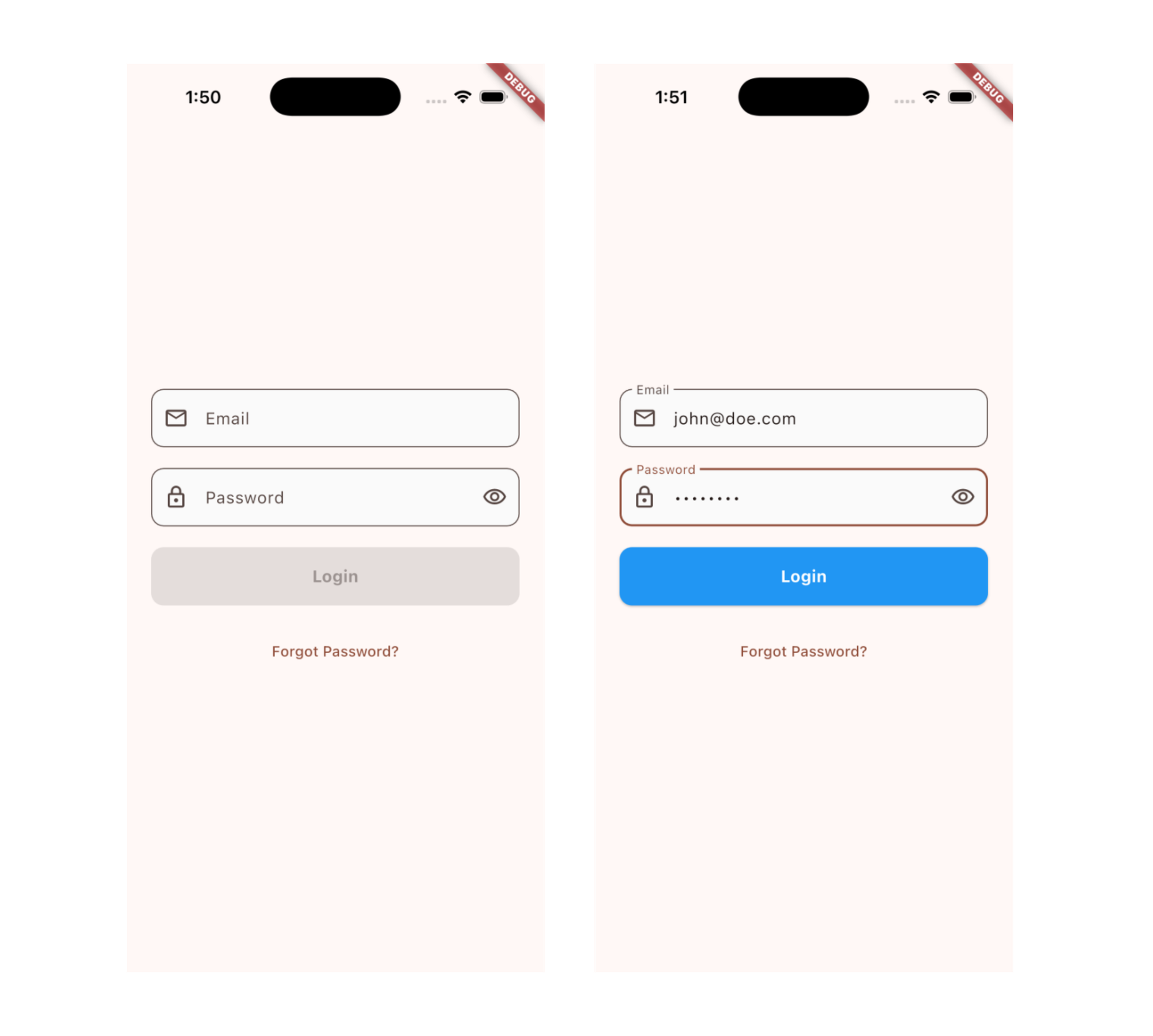
လေ့လာခဲ့ပြီးသလောက်နဲ့ Regrstration form မှာ value တွေ valid ဖြစ်တာ မဖြစ်တာမျိုးကို ဘယ်လိုစစ်သွားမလဲဆိုတဲ့ Login Screen ရေးကြည့်လိုက်ရအောင်ပါ။ မနက်ဖြန် ပြောပြမယ့် TextFormField မှာတော့ အခုရေးထားတာတွေကို ဘယ်လိုမျိုး ပိုလွယ်လွယ်ကူကူနဲ့ ရေးလို့ရမလဲဆိုတာ ဆက်ပြီး ဆွေးနွေးသွားပါ့မယ်။
class ModernLoginInput extends StatefulWidget {
  const ModernLoginInput({super.key});

  @override
  State<ModernLoginInput> createState() => _ModernLoginInputState();
}

class _ModernLoginInputState extends State<ModernLoginInput> {
  final _emailController = TextEditingController();
  final _passwordController = TextEditingController();
  bool _obscurePassword = true;
  bool _isFormValid = false;

  @override
  void initState() {
    super.initState();
    _emailController.addListener(_validateForm);
    _passwordController.addListener(_validateForm);
  }

  void _validateForm() {
    setState(() {
      _isFormValid =
          _emailController.text.isNotEmpty &&
          _passwordController.text.isNotEmpty;
    });
  }

  @override
  void dispose() {
    _emailController.dispose();
    _passwordController.dispose();
    super.dispose();
  }

  @override
  Widget build(BuildContext context) {
    return Padding(
      padding: const EdgeInsets.all(24.0),
      child: Column(
        mainAxisAlignment: MainAxisAlignment.center,
        spacing: 20,
        children: [
          // Email Field
          TextField(
            controller: _emailController,
            keyboardType: TextInputType.emailAddress,
            decoration: InputDecoration(
              labelText: 'Email',
              hintText: 'Enter your email',
              prefixIcon: const Icon(Icons.email_outlined),
              border: OutlineInputBorder(
                borderRadius: BorderRadius.circular(12),
              ),
              filled: true,
              fillColor: Colors.grey[50],
            ),
          ),

          // Password Field
          TextField(
            controller: _passwordController,
            obscureText: _obscurePassword,
            decoration: InputDecoration(
              labelText: 'Password',
              hintText: 'Enter your password',
              prefixIcon: const Icon(Icons.lock_outlined),
              suffixIcon: IconButton(
                icon: Icon(
                  _obscurePassword
                      ? Icons.visibility_outlined
                      : Icons.visibility_off_outlined,
                ),
                onPressed: () {
                  setState(() {
                    _obscurePassword = !_obscurePassword;
                  });
                },
              ),
              border: OutlineInputBorder(
                borderRadius: BorderRadius.circular(12),
              ),
              filled: true,
              fillColor: Colors.grey[50],
            ),
          ),

          // Login Button
          SizedBox(
            width: double.infinity,
            height: 56,
            child: ElevatedButton(
              onPressed: _isFormValid
                  ? () {
                      print("Email: ${_emailController.text}");
                      print("Password: ${_passwordController.text}");
                    }
                  : null,
              style: ElevatedButton.styleFrom(
                backgroundColor: Colors.blue,
                foregroundColor: Colors.white,
                shape: RoundedRectangleBorder(
                  borderRadius: BorderRadius.circular(12),
                ),
              ),
              child: const Text(
                "Login",
                style: TextStyle(fontSize: 16, fontWeight: FontWeight.bold),
              ),
            ),
          ),

          // Forgot Password Link
          TextButton(
            onPressed: () {
              print("Forgot password clicked");
            },
            child: const Text("Forgot Password?"),
          ),
        ],
      ),
    );
  }
}
ဒီနေ့ Day 21 အတွက်ကတော့ ဒီလောက်ပဲ ဖြစ်ပါတယ်။ အဆုံးထိ ဖတ်ပေးတဲ့အတွက် အများကြီး ကျေးဇူးတင်ပါတယ်။ နားမလည်တာတွေ အဆင်မပြေတာတွေ ရှိခဲ့ရင်လဲ အောက်မှာပေးထားတဲ့ discord server ထဲမှာ လာရောက်ဆွေးနွေးနိုင်ပါတယ်။ နောက်နေ့တွေမှာလဲ ဆက်လက်ပြီး sharing လုပ်သွားပေးသွားမှာ ဖြစ်တဲ့အတွက် subscribe လုပ်ထားဖို့ ဖိတ်ခေါ်ပါတယ်။
- Youtube: https://www.youtube.com/@arkarmintun
- Newsletter: https://arkar.dev/
- Discord: https://discord.gg/3xUJ6k6dkH