Day 24: GridView & Aspect Ratios
Build Instagram-style grids and product galleries with GridView. Learn GridView.count, GridView.extent and GridView.builder, how childAspectRatio really sizes your tiles, and the one-word mistake that squashes every card.

Day 23 မှာ ListView အကြောင်း ဆွေးနွေးခဲ့ပြီးပြီဆိုတော့ ဒီနေ့တော့ သူနဲ့ ညီအစ်ကိုလို ဖြစ်တဲ့ GridView အကြောင်း ဆက်ပြီး ဆွေးနွေးသွားမှာပဲ ဖြစ်ပါတယ်။ Instagram ရဲ့ Explore page, Pinterest, Shopee/Lazada လိုမျိုး shopping app တွေရဲ့ product listing, Photos app ထဲက gallery တွေကို စဥ်းစားကြည့်ပါ။ အားလုံးက item တွေကို အပေါ်အောက် တခုတည်း စီထားတာ မဟုတ်ဘဲ column နှစ်ခု သုံးခု ခွဲပြီး အကွက်လေးတွေ ပုံစံနဲ့ ပြထားကြတာ ဖြစ်ပါတယ်။ ဒီလို layout မျိုးကို Flutter မှာ GridView နဲ့ တည်ဆောက်ကြပါတယ်။
ဒီနေ့မှာတော့ GridView ကို ဘယ်လို အသုံးပြုရမလဲ၊ column အရေအတွက်ကို ဘယ်လို ထိန်းချုပ်မလဲ၊ phone နဲ့ tablet မှာ ဘယ်လို အလိုအလျောက် ပြောင်းလဲအောင် လုပ်မလဲ၊ ပြီးတော့ GridView သုံးတဲ့သူတိုင်း တခါတော့ ကြုံဖူးတဲ့ "card တွေ ပုံပျက်နေတာ" ပြဿနာကို childAspectRatio နဲ့ ဘယ်လို ဖြေရှင်းမလဲဆိုတာ ကြည့်သွားကြရအောင်ပါ။
GridView Constructors
ListView မှာ ListView(), ListView.builder(), ListView.separated() ဆိုပြီး constructor တွေ ရှိသလိုပဲ GridView မှာလဲ အသုံးပြုပုံ ကွဲပြားတဲ့ constructor တွေ ရှိပါတယ်။
GridView.count()- column အရေအတွက်ကို ကိုယ်တိုင် သတ်မှတ်ချင်တဲ့အခါGridView.extent()- item တခုရဲ့ width ဘယ်လောက်ထိ ကျယ်နိုင်လဲ (maxCrossAxisExtent) ကို သတ်မှတ်ပြီး column အရေအတွက်ကို Flutter က တွက်ပေးစေချင်တဲ့အခါGridView.builder()- item တွေ အများကြီး (ဒါမှမဟုတ် အကန့်အသတ်မရှိ) ပြဖို့လိုတဲ့အခါGridView()-gridDelegateကို ကိုယ်တိုင် ထည့်ပေးပြီးchildrenlist နဲ့ သုံးချင်တဲ့အခါGridView.custom()-SliverChildDelegateကို ကိုယ်တိုင် control လုပ်ချင်တဲ့အခါ (Day 23 ကListView.custom()နဲ့ သဘောတရား တူပါတယ်)
ဒီနေ့မှာတော့ အသုံးအများဆုံး ဖြစ်တဲ့ count, extent နဲ့ builder တို့ကို အဓိက ဆွေးနွေးသွားပါမယ်။
GridView.count
class GridCountExample extends StatelessWidget {
  const GridCountExample({super.key});

  @override
  Widget build(BuildContext context) {
    return Scaffold(
      appBar: AppBar(title: const Text('GridView.count')),
      body: GridView.count(
        crossAxisCount: 3,
        mainAxisSpacing: 8,
        crossAxisSpacing: 8,
        padding: const EdgeInsets.all(8),
        children: List.generate(12, (index) {
          return Container(
            alignment: .center,
            color: Colors.teal.shade200,
            child: Text('${index + 1}'),
          );
        }),
      ),
    );
  }
}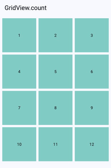
ဒါကတော့ GridView ကို အရိုးရှင်းဆုံး အသုံးပြုတဲ့ ပုံစံပဲ ဖြစ်ပါတယ်။ crossAxisCount: 3 လို့ ရေးလိုက်တာနဲ့ အလျားလိုက် row တခုမှာ item ၃ ခုစီ ပြပေးသွားမှာပါ။ ဒီနေရာမှာ property နာမည်တွေကို သေချာ နားလည်ထားဖို့ လိုပါတယ်။
- Main axis ဆိုတာ scroll လုပ်တဲ့ ဘက်ပါ။ default အနေနဲ့ GridView က အပေါ်အောက် scroll လုပ်တဲ့အတွက် main axis က ဒေါင်လိုက် ဖြစ်ပါတယ်။
- Cross axis ဆိုတာ main axis နဲ့ ထောင့်မှန်ကျတဲ့ ဘက်ပါ။ ဒီမှာဆို အလျားလိုက် ဖြစ်ပါတယ်။
ဒီတော့ crossAxisCount က အလျားလိုက် item ဘယ်နှစ်ခု ထားမလဲ၊ mainAxisSpacing က row တခုနဲ့တခုကြား အပေါ်အောက် အကွာအဝေး၊ crossAxisSpacing က column တခုနဲ့တခုကြား ဘယ်ညာ အကွာအဝေး ဖြစ်ပါတယ်။ Day 18 မှာ ဆွေးနွေးခဲ့တဲ့ Row/Column ရဲ့ main axis, cross axis နဲ့ သဘောတရား အတူတူပါပဲ။
💡 Dot shorthand သတိထားရန် -alignment: .centerလို Dart 3.10 shorthand ကို ဒီမှာ သုံးထားပေမယ့်color: .blueလို့တော့ ရေးလို့ မရပါဘူး။ shorthand က parameter ရဲ့ type (ဒီမှာဆိုColor) ထဲမှာ ရှိတဲ့ static member ကိုပဲ ရှာတာပါ။blueကColorထဲမှာ မဟုတ်ဘဲColorsclass ထဲမှာ ရှိတဲ့အတွက်Colors.blueလို့ အပြည့်ရေးပေးရပါမယ်။
GridView.extent
GridView.count ရဲ့ ပြဿနာက phone မှာ column ၃ ခုက ကြည့်ကောင်းပေမယ့် tablet ဒါမှမဟုတ် web မှာ ဖွင့်လိုက်တဲ့အခါ column ၃ ခုပဲ ရှိနေတဲ့အတွက် item တွေက အရမ်းကြီး ကျယ်ထွက်သွားတာပါ။ ဒီလိုမျိုး screen size ပေါ် မူတည်ပြီး column အရေအတွက် အလိုအလျောက် ပြောင်းစေချင်ရင်တော့ GridView.extent ကို သုံးနိုင်ပါတယ်။
class GridExtentExample extends StatelessWidget {
  const GridExtentExample({super.key});

  @override
  Widget build(BuildContext context) {
    return Scaffold(
      appBar: AppBar(title: const Text('GridView.extent')),
      body: GridView.extent(
        maxCrossAxisExtent: 150,
        mainAxisSpacing: 8,
        crossAxisSpacing: 8,
        padding: const EdgeInsets.all(8),
        children: List.generate(12, (index) {
          return Container(
            alignment: .center,
            color: Colors.orange.shade200,
            child: Text('${index + 1}'),
          );
        }),
      ),
    );
  }
}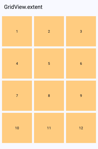
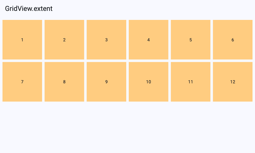
ဒီမှာ crossAxisCount မပါတော့ဘဲ maxCrossAxisExtent: 150 ဆိုပြီး item တခုရဲ့ width ဘယ်လောက်ထိ ကျယ်နိုင်လဲဆိုတာကို သတ်မှတ်ပေးလိုက်တာ ဖြစ်ပါတယ်။ code တကြောင်းမှ မပြောင်းဘဲ phone မှာ column ၃ ခု၊ tablet မှာ column ၆ ခု ဖြစ်သွားတာကို screenshot နှစ်ခုမှာ တွေ့ရမှာပါ။ column ဘယ်နှစ်ခု ထားမလဲဆိုတာကို Flutter က အောက်ကလို တွက်ပါတယ်။
columns = (available width ÷ (maxCrossAxisExtent + crossAxisSpacing)) ကို အပေါ်ကို round up လုပ်ထားတဲ့ ကိန်းဥပမာ width 390 ရှိတဲ့ phone မှာ padding ဘယ်ညာ 8 စီ နုတ်လိုက်ရင် available width 374 ကျန်ပါတယ်။ 374 ÷ (150 + 8) = 2.37 ဖြစ်လို့ round up လုပ်လိုက်တော့ column ၃ ခု ရပါတယ်။ ပြီးမှ ရလာတဲ့ column ၃ ခုနဲ့ နေရာကို တန်းတူ ခွဲဝေပေးတာ ဖြစ်ပါတယ်။
📏 Logical pixels - ဒီ article ထဲမှာ ပြောတဲ့ width 390, 150, 16 စတဲ့ ဂဏန်းတွေ အားလုံးက screen ရဲ့ physical pixel တွေ မဟုတ်ဘဲ Flutter ရဲ့ logical pixel တွေ ဖြစ်ပါတယ်။ ဥပမာ width 390 logical pixel ရှိတဲ့ iPhone ရဲ့ physical pixel က 1170 (3x) ဖြစ်ပါတယ်။ Flutter က device တိုင်းမှာ အရွယ်အစား တူတူ မြင်ရအောင် logical pixel နဲ့ပဲ layout တွက်တာ ဖြစ်ပါတယ်။
⚠️maxCrossAxisExtentကို နာမည်အတိုင်း "ဒီထက် လုံးဝ မကျော်ရ" လို့ တိတိကျကျ မမှတ်ပါနဲ့။ Flutter က spacing ပါ ထည့်တွက်တဲ့အတွက် item width က အနည်းငယ် ကျော်သွားနိုင်ပါတယ်။ ဥပမာ available width 316 မှာဆို 316 ÷ 158 = 2 ဖြစ်လို့ column ၂ ခု ရပြီး item တခုရဲ့ width က (316 − 8) ÷ 2 = 154 ဖြစ်သွားပါတယ်။ ခန့်မှန်းခြေ အများဆုံး width လို့ပဲ မှတ်ထားရင် ရပါပြီ။
GridView.builder & Grid Delegates
ListView တုန်းက ပြောခဲ့သလိုပဲ GridView မှာလဲ item တွေ အများကြီး ပြဖို့ လိုလာတဲ့အခါ children list ထဲမှာ widget အားလုံးကို တခါတည်း ဆောက်ထားတာ performance အတွက် မကောင်းပါဘူး။ ဒီအခါမှာ GridView.builder ကို သုံးရပါမယ်။ သူကလဲ ListView.builder လိုပဲ screen ပေါ်မှာ မြင်ရမယ့် item တွေကိုပဲ (scroll cache အတွက် အနည်းငယ် အပိုနဲ့) build လုပ်ပေးတာ ဖြစ်ပါတယ်။ item ၁၀၀၀ ပါတဲ့ grid ကို စမ်းကြည့်တဲ့အခါ ပထမဆုံး screen အတွက် item ၁၀၀၀ လုံး မဟုတ်ဘဲ မြင်ရတဲ့ အပိုင်းလောက်ပဲ build လုပ်တာကို တွေ့ရမှာပါ။
GridView.builder မှာတော့ count, extent လို parameter တွေ တိုက်ရိုက် မပါတော့ဘဲ gridDelegate ဆိုတာကို ထည့်ပေးရပါတယ်။ Grid delegate ဆိုတာ grid ရဲ့ layout logic (column ဘယ်နှစ်ခု၊ item တခု ဘယ်လောက် ကြီးမလဲ) ကို သတ်မှတ်ပေးတဲ့ object ပဲ ဖြစ်ပါတယ်။ Flutter မှာ အသင့်ပါလာတဲ့ delegate ၂ မျိုး ရှိပါတယ်။
| Delegate | အဓိက parameter | သူနဲ့ ညီတဲ့ constructor |
|---|---|---|
SliverGridDelegateWithFixedCrossAxisCount |
crossAxisCount |
GridView.count |
SliverGridDelegateWithMaxCrossAxisExtent |
maxCrossAxisExtent |
GridView.extent |
တကယ်တော့ GridView.count က အတွင်းထဲမှာ SliverGridDelegateWithFixedCrossAxisCount ကို သုံးထားတာဖြစ်ပြီး GridView.extent က SliverGridDelegateWithMaxCrossAxisExtent ကို သုံးထားတာ ဖြစ်ပါတယ်။ ဒီတော့ delegate နှစ်ခုလုံးမှာ အောက်က parameter တွေ ပါပါတယ်။
| Parameter | Default | အဓိပ္ပာယ် |
|---|---|---|
mainAxisSpacing |
0.0 |
row တွေကြား အကွာအဝေး |
crossAxisSpacing |
0.0 |
column တွေကြား အကွာအဝေး |
childAspectRatio |
1.0 |
item ရဲ့ width ÷ height |
mainAxisExtent |
null |
item ရဲ့ height ကို logical pixel နဲ့ တိုက်ရိုက် သတ်မှတ်ခြင်း (ထည့်ထားရင် childAspectRatio ကို မသုံးတော့ပါ) |
Example - Instagram Explore Grid
class ExploreGrid extends StatelessWidget {
  const ExploreGrid({super.key});

  static const icons = [
    Icons.landscape,
    Icons.pets,
    Icons.restaurant,
    Icons.flight,
    Icons.music_note,
    Icons.sports_soccer,
  ];

  @override
  Widget build(BuildContext context) {
    return Scaffold(
      appBar: AppBar(title: const Text('Explore')),
      body: GridView.builder(
        itemCount: 60,
        gridDelegate: const SliverGridDelegateWithFixedCrossAxisCount(
          crossAxisCount: 3,
          mainAxisSpacing: 2,
          crossAxisSpacing: 2,
        ),
        itemBuilder: (context, index) {
          final color = Colors.primaries[index % Colors.primaries.length];
          return Container(
            color: color.shade300,
            child: Icon(
              icons[index % icons.length],
              color: Colors.white,
              size: 36,
            ),
          );
        },
      ),
    );
  }
}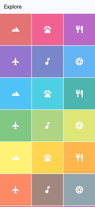
Instagram ရဲ့ Explore page လိုမျိုး column ၃ ခု၊ item တွေကြား 2 logical pixel လောက်ပဲ ခြားထားတဲ့ grid ဖြစ်ပါတယ်။ childAspectRatio မထည့်ထားတဲ့အတွက် default 1.0 ဖြစ်ပြီး item တိုင်း စတုရန်း ဖြစ်နေတာကို တွေ့ရမှာပါ။ ဒီ example မှာ အရောင်တွေနဲ့ icon တွေကိုပဲ ပြထားပေမယ့် တကယ့် app မှာဆို ပုံတွေနဲ့ အစားထိုးလိုက်ရုံပါပဲ။
itemBuilder: (context, index) {
  return Image.network(
    'https://picsum.photos/seed/$index/300/300',
    fit: .cover,
    errorBuilder: (context, error, stackTrace) {
      return Container(
        color: Colors.grey.shade300,
        child: const Icon(Icons.broken_image),
      );
    },
  );
},
fit: .cover က ပုံကို အကွက်ထဲမှာ အပြည့် ဖြည့်ပြီး ပိုနေတဲ့ အစွန်းတွေကို ဖြတ်ပေးတာ ဖြစ်ပါတယ်။ internet မရတဲ့အခါ ဒါမှမဟုတ် ပုံ load မရတဲ့အခါ error ပြနေမယ့်အစား ကိုယ်ပြချင်တဲ့ fallback UI (ဒီမှာဆို broken image icon) ကို ပြပေးနိုင်အောင် errorBuilder ကိုလဲ ထည့်ထားပေးဖို့ အကြံပြုပါတယ်။
Mastering childAspectRatio
GridView သုံးတဲ့အခါ အများဆုံး ကြုံရတဲ့ ပြဿနာက card ထဲက content တွေ မဆံ့လို့ အဝါအမဲ overflow error တက်တာ ဒါမှမဟုတ် card တွေ ထူးဆန်းတဲ့ အရွယ်အစား ဖြစ်နေတာပါ။ ဒါကို နားလည်ဖို့ GridView က item တခုရဲ့ size ကို ဘယ်လို တွက်လဲ သိထားဖို့ လိုပါတယ်။
- Width ကို အရင် တွက်ပါတယ် - ရှိတဲ့ width ထဲက spacing တွေ နုတ်ပြီး column အရေအတွက်နဲ့ စားပါတယ်။
item width = (available width − crossAxisSpacing × (columns − 1)) ÷ columns - Height ကို width ကနေ တွက်ပါတယ် -
mainAxisExtentထည့်ထားရင် အဲ့ဒီ တန်ဖိုး၊ မထည့်ထားရင်တော့item height = item width ÷ childAspectRatio
ဆိုလိုတာက GridView ထဲမှာ item ရဲ့ height ကို content က ဆုံးဖြတ်တာ မဟုတ်ပါဘူး။ Column ထဲမှာ ကိုယ်ထည့်ထားတဲ့ Text, Image တွေ ဘယ်လောက်ပဲ ရှည်ရှည် grid က ပေးတဲ့ height ထဲမှာပဲ ဆံ့အောင် ထည့်ရမှာ ဖြစ်ပါတယ်။ ဒါကြောင့် childAspectRatio ကို content နဲ့ ကိုက်အောင် ရွေးပေးဖို့ လိုတာပါ။
| childAspectRatio | ပုံသဏ္ဍာန် | သင့်တော်တဲ့ နေရာ |
|---|---|---|
1.0 |
စတုရန်း | Instagram grid, gallery |
0.75 (3:4) ဒါမှမဟုတ် 0.7 |
ဒေါင်လိုက် ရှည်တဲ့ ထောင့်မှန်စတုဂံ | product card, book cover, movie poster |
1.5 (3:2) |
အလျားလိုက် ကျယ်တဲ့ ထောင့်မှန်စတုဂံ | dashboard card, video thumbnail |
Example - Product Gallery
class ProductGrid extends StatelessWidget {
  const ProductGrid({super.key});

  @override
  Widget build(BuildContext context) {
    return Scaffold(
      appBar: AppBar(title: const Text('Marketplace Grid')),
      body: GridView.builder(
        padding: const EdgeInsets.all(12),
        itemCount: products.length,
        gridDelegate: const SliverGridDelegateWithMaxCrossAxisExtent(
          maxCrossAxisExtent: 200,
          mainAxisSpacing: 12,
          crossAxisSpacing: 12,
          childAspectRatio: 0.75,
        ),
        itemBuilder: (context, index) {
          return ProductCard(product: products[index]);
        },
      ),
    );
  }
}

class ProductCard extends StatelessWidget {
  const ProductCard({super.key, required this.product});

  final Product product;

  @override
  Widget build(BuildContext context) {
    return Card(
      clipBehavior: .antiAlias,
      child: Column(
        crossAxisAlignment: .start,
        children: [
          Expanded(
            child: Container(
              width: double.infinity,
              color: Colors.blue.shade50,
              child: Icon(product.icon, size: 48, color: Colors.blue),
            ),
          ),
          Padding(
            padding: const EdgeInsets.all(8),
            child: Column(
              crossAxisAlignment: .start,
              children: [
                Text(
                  product.name,
                  maxLines: 1,
                  overflow: .ellipsis,
                  style: const TextStyle(fontWeight: .bold),
                ),
                const SizedBox(height: 4),
                Text(
                  '\$${product.price.toStringAsFixed(2)}',
                  style: TextStyle(color: Colors.green.shade700),
                ),
              ],
            ),
          ),
        ],
      ),
    );
  }
}
Product model နဲ့ products list ကတော့ ရိုးရိုး class တခုပါ။
class Product {
  final String name;
  final double price;
  final IconData icon;

  const Product({required this.name, required this.price, required this.icon});
}

const products = [
  Product(name: 'Sneakers', price: 89.99, icon: Icons.directions_run),
  Product(name: 'Headphones', price: 149.00, icon: Icons.headphones),
  Product(name: 'Backpack', price: 59.50, icon: Icons.backpack),
  Product(name: 'Watch', price: 199.00, icon: Icons.watch),
  Product(name: 'Camera', price: 499.00, icon: Icons.photo_camera),
  Product(name: 'Sunglasses', price: 39.99, icon: Icons.wb_sunny),
  Product(name: 'Laptop', price: 999.00, icon: Icons.laptop_mac),
  Product(name: 'Coffee Mug', price: 12.00, icon: Icons.coffee),
];
ဒီ example မှာ သတိထားကြည့်စရာ ၃ ချက် ရှိပါတယ်။
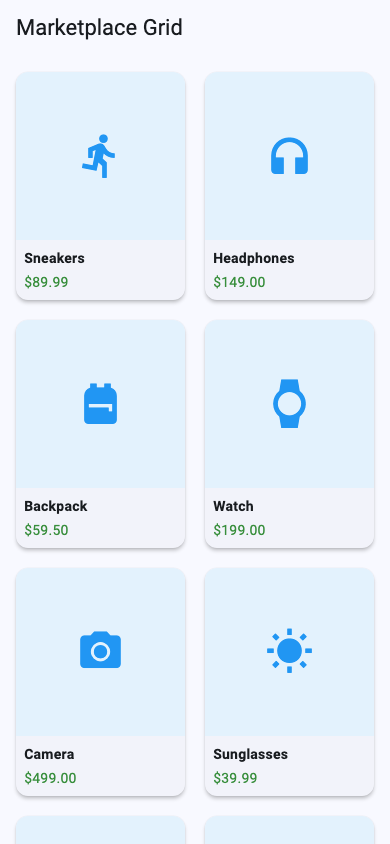
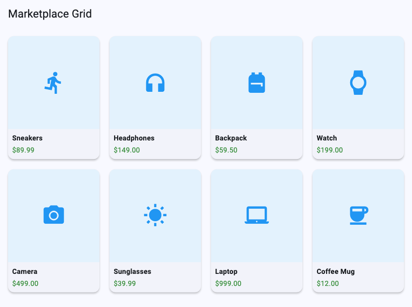
SliverGridDelegateWithMaxCrossAxisExtentကို သုံးထားတဲ့အတွက် phone (width 390) မှာ column ၂ ခု၊ tablet (width 820) မှာ column ၄ ခု အလိုအလျောက် ဖြစ်သွားပါတယ်။ phone မှာ တွက်ကြည့်ရင် padding နုတ်ပြီး 366 ကျန်တယ်၊ 366 ÷ (200 + 12) = 1.73 ကို round up လုပ်တော့ ၂ ခု ဖြစ်ပါတယ်။childAspectRatio: 0.75ဖြစ်တဲ့အတွက် phone မှာ item width က (366 − 12) ÷ 2 = 177 ဖြစ်ပြီး height က 177 ÷ 0.75 = 236 ဖြစ်ပါတယ်။ ဒေါင်လိုက် ရှည်တဲ့ card ပုံစံ ရလာပါတယ်။- ပုံနေရာကို
Expandedနဲ့ ထည့်ထားတဲ့အတွက် နာမည်နဲ့ ဈေးနှုန်းက သူတို့ လိုသလောက် နေရာယူပြီး ကျန်တဲ့ နေရာ အကုန်ကို ပုံက ယူသွားပါတယ်။ tile size ပြောင်းသွားရင် ပုံက လိုက်ချုံ့၊ လိုက်ချဲ့ ပေးတဲ့အတွက် screen size အမျိုးမျိုးမှာ overflow ဖြစ်ဖို့ အများကြီး နည်းသွားပါတယ်။ နာမည် ရှည်လာရင်လဲmaxLines: 1နဲ့overflow: .ellipsisက "..." နဲ့ ဖြတ်ပေးပါတယ်။ ဒါပေမယ့် စာသားတွေရဲ့ height ကတော့ tile ထဲမှာ ဆံ့ဖို့ လိုသေးပါတယ်။ user က phone setting မှာ font size ကြီးကြီး (text scaling) သုံးထားရင် စာသားတွေ မြင့်လာပြီး overflow ဖြစ်နိုင်ပါသေးတယ်။ ဒါကြောင့်childAspectRatioကို ရွေးတဲ့အခါ စာသားအတွက် နေရာ လုံလုံလောက်လောက် ချန်ထားပေးဖို့ လိုပါတယ်။ ဒါက GridView card တွေ တည်ဆောက်တဲ့အခါ အရေးကြီးဆုံး pattern ပဲ ဖြစ်ပါတယ်။
mainAxisExtent - Height ကို တိုက်ရိုက် သတ်မှတ်ခြင်း
တချို့ card တွေက width ဘယ်လောက်ပဲ ဖြစ်ဖြစ် height က အတူတူပဲ ဖြစ်စေချင်တာမျိုး ရှိပါတယ်။ ဥပမာ ListTile လိုမျိုး စာသားပဲ ပါတဲ့ card တွေပါ။ ဒီလို အခြေအနေမှာ ratio နဲ့ တွက်နေမယ့်အစား mainAxisExtent နဲ့ height ကို logical pixel နဲ့ တိုက်ရိုက် သတ်မှတ်လို့ ရပါတယ်။
GridView.builder(
  padding: const EdgeInsets.all(12),
  itemCount: 20,
  gridDelegate: const SliverGridDelegateWithFixedCrossAxisCount(
    crossAxisCount: 2,
    mainAxisSpacing: 12,
    crossAxisSpacing: 12,
    mainAxisExtent: 120,
  ),
  itemBuilder: (context, index) {
    return Card(
      child: ListTile(
        leading: const Icon(Icons.folder),
        title: Text('Folder ${index + 1}'),
        subtitle: Text('${(index + 1) * 3} files'),
      ),
    );
  },
)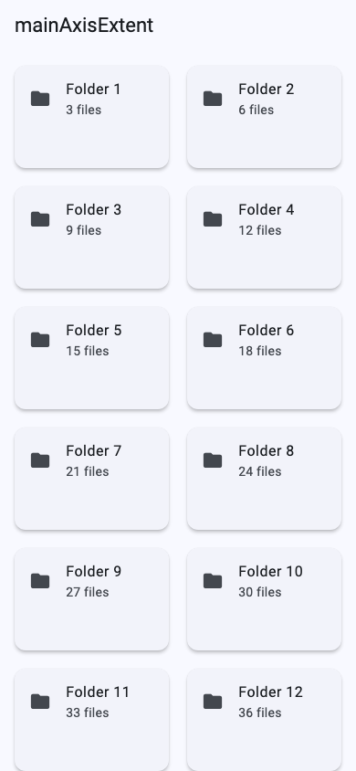
mainAxisExtent ထည့်လိုက်တာနဲ့ childAspectRatio ကို ထည့်ထားရင်တောင် လျစ်လျူရှုသွားပြီး item တိုင်းရဲ့ height က 120 ဖြစ်သွားပါတယ်။
Common Mistake: mainAxisExtent vs mainAxisSpacing
နာမည်တွေ ဆင်တူနေတဲ့အတွက် အရမ်း မှားလွယ်တဲ့ အချက်တခု ရှိပါတယ်။ row တွေကြား space ပေးချင်လို့ mainAxisSpacing ရေးရမယ့်နေရာမှာ autocomplete က mainAxisExtent ကို ရွေးမိသွားတာမျိုးပါ။
gridDelegate: const SliverGridDelegateWithFixedCrossAxisCount(
  crossAxisCount: 2,
  childAspectRatio: 0.75,
  crossAxisSpacing: 16,
  mainAxisExtent: 16, // ❌ row ကြား space 16 ကို ဆိုလိုတာ
),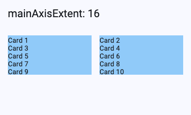
compile error လဲ မတက်၊ warning လဲ မပြတဲ့အတွက် ရှာရ ခက်ပါတယ်။ ဒါပေမယ့် ရလဒ်ကတော့ အပေါ်က ပုံအတိုင်း item တိုင်းရဲ့ height က 16 logical pixel ပဲ ဖြစ်သွားပြီး childAspectRatio: 0.75 ကိုလဲ လုံးဝ မသုံးတော့ပါဘူး။ card တွေ ပြားကပ်နေတာ ဒါမှမဟုတ် content တွေ ပျောက်နေတာ တွေ့ရင် ဒီ property ကို အရင်ဆုံး စစ်ကြည့်ပါ။
gridDelegate: const SliverGridDelegateWithFixedCrossAxisCount(
  crossAxisCount: 2,
  childAspectRatio: 0.75,
  crossAxisSpacing: 16,
  mainAxisSpacing: 16, // ✅
),
Fixed Count vs Max Extent
| Delegate | သင့်တော်တဲ့ နေရာ | Screen ကျယ်လာရင် |
|---|---|---|
FixedCrossAxisCount / GridView.count |
Instagram grid လို column အရေအတွက် အမြဲ အတူတူ ဖြစ်စေချင်တဲ့ mobile app | column အရေအတွက် မပြောင်းဘဲ item တွေ ပိုကြီးလာ |
MaxCrossAxisExtent / GridView.extent |
phone, tablet, web, desktop အကုန် support လုပ်ရမယ့် app | item size သိပ်မပြောင်းဘဲ column ပိုများလာ |
Examples
- Photo gallery / Instagram explore →
FixedCrossAxisCount(3 columns),childAspectRatio: 1 - Shopping product listing →
MaxCrossAxisExtent,childAspectRatio: 0.7 ~ 0.75 - Dashboard stats cards →
MaxCrossAxisExtent,childAspectRatio: 1.5 - Text-only cards →
mainAxisExtentနဲ့ height ကို တိုက်ရိုက် သတ်မှတ် - Item ဘယ်နှစ်ခု ရှိမလဲ မသိတဲ့ API data → အမြဲ
GridView.builder
ဒီနေ့ ဆွေးနွေးခဲ့တဲ့ GridView.builder, childAspectRatio နဲ့ Expanded pattern တွေကို နောက်ရက်တွေမှာ စတင်မယ့် Pixly project မှာ photo grid တည်ဆောက်တဲ့အခါ တိုက်ရိုက် ပြန်သုံးသွားမှာ ဖြစ်ပါတယ်။
Source code: ဒီနေ့ရဲ့ code အပြည့်အစုံကို GitHub မှာ run ကြည့်လို့ ရပါတယ်။
ဒီနေ့ Day 24 အတွက်ကတော့ ဒီလောက်ပဲ ဖြစ်ပါတယ်။ အဆုံးထိ ဖတ်ပေးတဲ့အတွက် အများကြီး ကျေးဇူးတင်ပါတယ်။ နားမလည်တာတွေ အဆင်မပြေတာတွေ ရှိခဲ့ရင်လဲ အောက်မှာပေးထားတဲ့ discord server ထဲမှာ လာရောက်ဆွေးနွေးနိုင်ပါတယ်။ နောက်နေ့တွေမှာလဲ ဆက်လက်ပြီး sharing လုပ်သွားပေးသွားမှာ ဖြစ်တဲ့အတွက် subscribe လုပ်ထားဖို့ ဖိတ်ခေါ်ပါတယ်။
- Youtube: https://www.youtube.com/@arkarmintun
- Newsletter: https://arkar.dev/
- Discord: https://discord.gg/3xUJ6k6dkH